Pirate Polish

This blog is the home of Pirate Polish! To see Pirate Polish swatches, click here. To visit Pirate Polish on Facebook, click here.
Showing posts with label creme. Show all posts

Sunday, August 11, 2013

Chanel Dragon

Are five photos too many for a red creme? Not when it's this red creme! This is Chanel's Dragon. Fitting name- this lacquer is hard to ignore. I wore this and loved it, especially for a Vaudeville-themed "speakeasy" night I attended a while back. This was probably the longest my nails have ever been, and I trimmed them down shortly after this manicure, but it was really fun to sport long, red nails for a couple days. Very retro and glamourous! 


What do you think of Chanel Dragon? Does it catch your eye?

Wednesday, June 12, 2013

Illamasqua Harem and Nurture

Tonight I've got two gorgeous Illamasqua lacquers to show to you: Harem and Nourish. 

Harem was released earlier this year and is a lovely blue-based pink creme; it's not quite your standard pastel pink- it has much more of a lavender hue to it. As per usual, the formula was great, barely needing two coats for perfection. 


Nurture is part of last year's Rubber Brights collection, and sports an interesting satin/rubber finish- it is also the most incredible vivid green. It's extremely bright, but doesn't come off as a citrusy neon- rather, it has an beautiful fresh leafy-ness to it, if that makes sense. I absolutely loved wearing this one, and was sorry to remove it. Very unique.


What do you think of these lacquers from Illamasqua? Can you think of any polishes similar to Illamasqua Nurture?

Saturday, June 8, 2013

Picture Polish Honey Dew and China Glaze It's A Trap-eze

First of all, my apologies for a lengthy disappearance- sometimes life (regrettably) gets in the way of blogging about nail polish. I should be back to posting fairly regularly, however. And to kick that off, I've got a great spring manicure to show you: Picture Polish Honey Dew, with a single layer of China Glaze It's A Trap-eze layered overtop of the ring finger as an accent nail. I love the way this turned out- Honey Dew is a gorgeous, dreamy, melon green, and It's A Trap-eze is sheer enough to let the base colour shine through to create a delicious milky effect. 


Speaking of Picture Polish, did anyone else get the chance to try the new glitter base, "Revolution"? I was able to get my hands on it through Nail Polish Canada when it first went up on the site, and have only really tried it with Cirque's French Roast (a pretty glitter dense polish), and can't say I noticed a dramatic difference in removal. If I did it again, I'd probably just opt for foil method. I'm assuming it's more to do with my particular body chemistry, as others have reported excellent results using Revolution.


What about you? Any great successes (or otherwise) to report with Picture Polish Revolution as an aid in glitter removal?

Tuesday, May 21, 2013

Sinful Colors Candy Coated and Sweet Tooth

Today I've got two lovely shades from the Sinful Colors "Sugar Rush" collection- I can't resist a nice purple (especially with a price tag under $2), and this is proof. Candy Coated is a light blue-toned purple creme. This one is my favourite; it has a great formula and it really looked flawless on. One of my favourite springtime lacquers! 


Sweet Tooth is a warmer and brighter pinky-purple. Still a gorgeous shade, although it didn't quite take the cake for me in the same way Candy Coated did. It reminds me a tiny bit of a lighter Zoya Perrie, actually.


Did you pick up any lacquers from the Sinful Colors Sugar Rush collection?

Wednesday, May 1, 2013

Color Club Bright Night and Pearl-spective

Today I've got two lacquers from the Color Club Kaleidoscope Collection (Spring 2013): Bright Night (intense, vivid, cobalt blue), and Pearl-spective (a fine flakey shimmer topcoat that flashes pink and gold). I layered Pearl-spective over top of Bright Night for this manicure; I was really happy with how much Pearl-spective stood out as a topcoat, and loved how finely milled the flakey shimmer was. 


And a shot of Bright Night by itself- sorry for the partial shadow! This really deserves a number of photos because it's so perfectly vivid and blue (not to mention utterly smooth and creamy), but I've just got this one for you today.


What do you think of these two shades from the Color Club Kaleidoscope collection?

Saturday, March 30, 2013

Zoya Spam!

Happy Easter, everyone! How about some Zoya spam to celebrate? 

Zoya Aurora: gorgeous (and insanely sparkly) scattered holographic purple. Looks different in the following pictures depending on lighting- in reality, it's somewhere in between. 


Zoya Bela: soft and squishy-looking peachy pink jelly.


Zoya Jacqueline: creamy yellow-toned off-white creme.


Zoya Marley: a light pastel purple with soft pearly shimmer. Very pretty, and perfect for Easter!


I hope everyone is having a wonderful weekend!

Saturday, March 9, 2013

OPI Suzi Says Da! + Dandy Nails Grave Robber

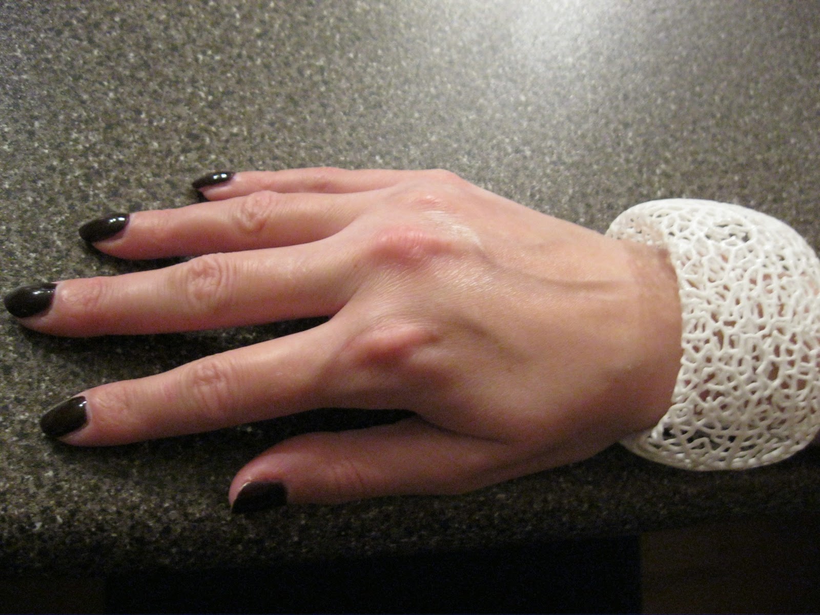
I'm ashamed to say that these pictures are from a manicure I wore waaaaay back at the beginning of last November. I guess they just kept getting pushed to the back of my un-posted folder. Nevertheless, you're finally seeing them tonight. Suzi Says Da! is one of the polishes I picked up from the OPI Russian collection (which I'm extremely enamoured with- it's an older collection from Fall 2007, but there are still a few polishes kicking around from it if you look hard enough). This is a deep red-toned brown creme. It reminds me a little of darker Chanel Rouge Noir. From what I recall, the formula was good, and I used two coats for these pictures. 


This one was taken under bright artificial light:


This was also a perfect base colour for Dandy Nails Grave Robber, a combination of metallic orange and steel-blue shredded glitter in a clear base. Very unique, and such a cool colour combination. I applied it as a gradient to the tips of my nails. I really love how this turned out, and it wore for ages. 


I'll also take this opportunity to show you a really cool bracelet I picked up last fall- it's a white "blood vessel" motif cuff that I really loved pairing with the vampy-ness of Suzi Says Da!. I purchased it from Nervous System's Etsy store. I highly recommend checking them out- they make some really amazing and unique items!


What do you think of my accessorizing? Have I piqued your interest in anything I've shown you today?

Wednesday, February 20, 2013

Essie Spring 2013 Swatches (Go Ginza and Maximillian Strasse Her)

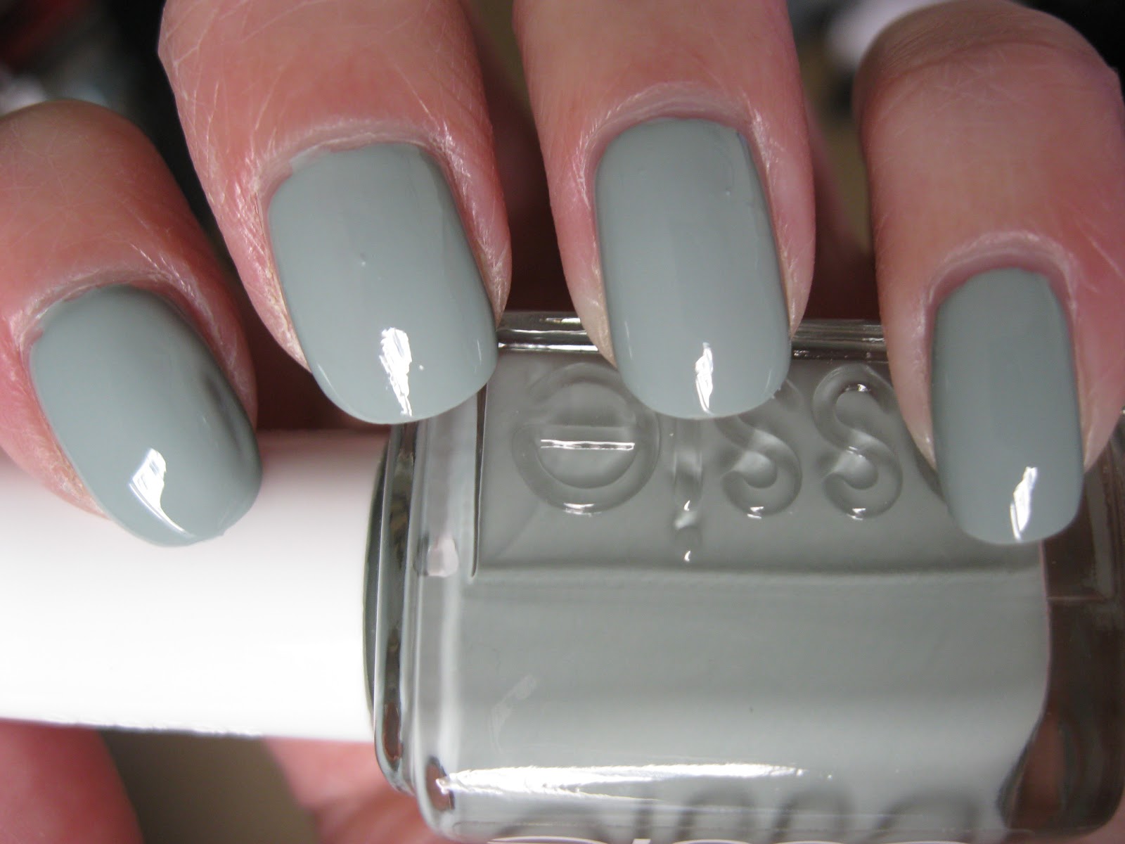
Tonight I've got a couple swatches from the Essie Spring 2013 Madison Ave-Hue Collection: Go Ginza, a pale pink/lavender, and Maximillian Strasse Her, a faded light grey/green.

Go Ginza reminds me a little bit of OPI Steady As She Rose, or maybe OPI Panda-monium Pink. It has the same dusty/greyed out finish as Steady As She Rose has (one of my all-time favourite polishes, by the way), and straddles the line between pale pink and lavender. Very pretty! The formula was a little runny and hard to work with, but covered in two coats.


Maximillian Strasse Her is a light greyed out pale green creme; the formula on this was better than Go Ginza, easy to work with and perfect in two coats. While this reminds me a bit of Essie Absolutely Shore, this is definitely a deeper and murkier shade; more in the army green category than the pastel one.


This collection kind of popped up out of nowhere- I hadn't even heard of it, then happened to see it at a Walgreen's. Which, by the way, you might be surprised to hear seeing as how there are no Walgreen's in Canada. How, then? Because for the last week I've been here: 


It's been awesome, and I'm fully prepared to leave my heart in San Francisco. 

What do you think of these shades from the Essie Spring 2013 Collection? Are you planning on picking any of them up? 

Friday, February 15, 2013

Butter London Cuppa (plus a comparison!)

Because I have an insatiable urge to buy ALL the putty/taupe cremes I see, I've got Butter London Cuppa to share with you today! This is from the recent Butter London spring collection release, and it is (surprise, surprise) a milky/almond beige creme. Lovely formula, perfect in two coats. This first picture is taken under artificial light, which typically makes the colour appear more yellow-toned; the following two are taken in natural light, which shows Cuppa to be a lovely milky beige.


I also thought a comparison might be in order, seeing how close SpaRitual Quietness looks to Butter London Cuppa in the bottle:


Left to Right: SpaRitual Quietness, Butter London Cuppa, Quietness, Cuppa.


As you can see, SpaRitual Quietness is actually quite a bit more yellow in tone; Butter London Cuppa is more of a cool, almond shade. While I like both of these, I think Cuppa is the more flattering option. What do you think?