Pirate Polish

This blog is the home of Pirate Polish! To see Pirate Polish swatches, click here. To visit Pirate Polish on Facebook, click here.
Showing posts with label Nails Inc. Show all posts

Tuesday, January 22, 2013

Nails Inc - Sweets Way

Today I've got one of the Nails Inc Sprinkles polishes to share with you; some time ago I also showed you Pudding Lane and Sugar House Lane, but I think Sweets Way tops them both. This is a milky-based glitter polish, featuring delicate blue, peachy-pink, and white glitters in a white base. I don't recall application being too much of a pain, and it had decent coverage; overall, an excellent lacquer. 


What do you think of Sweets Way? Did you pick this one up when it first came out?

Wednesday, August 22, 2012

Nails Inc Sugar House Lane

Tonight I have Nails Inc Sugar House Lane to show you; this is the second of the "Sprinkles" polishes I've purchased (see Pudding Lane here). 


This one is a strange mix... small black and white glitter in a taupe/putty base. Very odd. The formula was good, and this covered in two coats, but I think I prefer Pudding Lane over this one. I think the blue base in Pudding Lane really made the glitter pop; in this case, I think the taupey base colour just looks a little too muddy for my liking. Not that it's bad! I still love the jelly sandwich-esque look, it just doesn't wow me as much as yesterday's shade. 


Unlike Pudding Lane, Sugar House Lane (the actual location is in Newham, a borough of London) doesn't seem to have any particular associations with major historic events, although it was a site of intense industrial growth from the 18th century on. And that's my random tidbit of information about today's Nails Inc namesake!


What do you think of Nails Inc Sugar House Lane? Do you like it better than Pudding Lane?

Monday, August 20, 2012

Nails Inc Pudding Lane

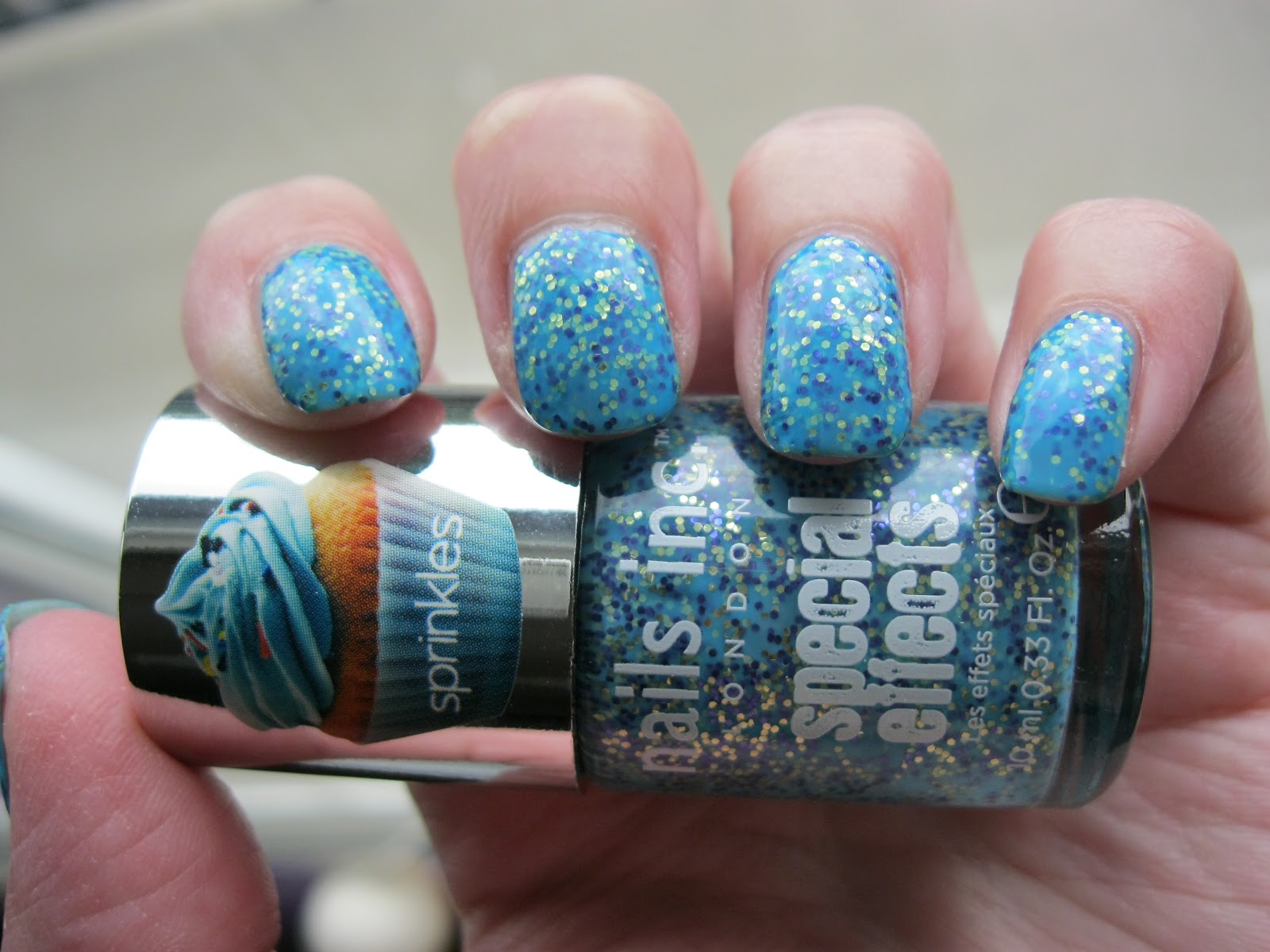
As soon as I heard about the Nails Inc "Sprinkles" collection, I knew I had to get my nails on them. The combination of different glitters in a coloured/milky base is right up my alley. It's also a very indie-polish thing to do, so it's interesting to see a bigger brand like Nails Inc trying this out. 

Today I have Pudding Lane to share with you; this is a mixture of gold and navy blue glitter in a medium blue base. Interestingly enough, the gold glitter looks more like green because of the blue base colour. Coverage was good in two coats. 


The overall effect is that of a "jelly sandwich" manicure, without the extra work of having to layer a sheer polish underneath and overtop of a glitter. Very cool.


You know how Nails Inc polishes are always named after an actual street/avenue/square in London? Well, I had to google it...


...and there is an actual Pudding Lane in London.


And apparently Pudding Lane is rather infamous, too, for being the site of The Great Fire of London (1666), which started in a bakery on Pudding Lane. Well, I have to admit I learned something new today.

What do you think of Nails Inc Pudding Lane? 


Wednesday, July 18, 2012

Experimental Layering Post

I've been meaning to do this post for ages, as I've accumulated requests for the last month or two. Anyways, finally it's here! 

Top to bottom we have Lynnderella Chocolotta Love over a white base, Ozotic 505 over black (which makes the colour shift look incredible!), Picture Polish Mask-a-rade over black, and Up Colors Beijo na Boca also over black. 


On the thumb you can see Nails Inc Cheyne Walk over black, which doesn't really discernibly change the look of it so much; with one more coat it would look the exact same as it would without any base colour.


I hope these layering swatches were helpful for you! Out of these, I think Ozotic 505 and Picture Polish Mask-a-rade benefit the most from being layered over black- it really brings out the colour shift.


Tuesday, July 3, 2012

"Hero Shade" Nails Inc Porchester Square

Today I have a Nails Inc polish to share with you: Porchester Square. This is a putty-ish taupe/grey creme, and I love it. Perfect formula, easy to apply, and shades like these are so easy to wear- definitely a good shade to have on hand for those days when you need something effortlessly elegant and beautifully neutral. 


Now, as you might have noticed, this particular bottle of Porchester Square sports a sticker heralding it as a "Hero Shade". I have no idea what that means in the nail lacquer context, but it did make me think of the "Hero City" designation bestowed upon several cities in Russia and the former USSR. The "Hero City" title was awarded to cities that displayed outstanding heroism during the Great Patriotic War (World War II). It's quite interesting stuff, and if you want to know more I recommend checking out the Wikipedia article on Hero Cities.


I was lucky enough to visit one of the Hero Cities while I was in Ukraine- so here are a few pictures of Hero City Odessa!

The (rather grand) train station:


Beautiful Odessa Opera and Ballet Theatre (gorgeous neo-baroque architecture!):


Slightly frightening architectural details:


The lovely interior of the Opera and Ballet Theatre. For the record, the performances I saw here were top-notch, which is remarkable considering tickets only cost about $15.


Odessa has a lot of fantastic cafes and restaurants! Below you can see the Cafe Fanconi...


...and my favourite cafe, компот (Compote). The pastries here were delicious!


A view of the harbour, as seen from the top of the Potemkin steps (the tall structure is a huge hotel).


Looking up at the Potemkin steps (easier to climb down that to climb up...).


Well, what did you think of Hero Shade Porchester Square? Does it deserve its Hero Shade honorific?

Friday, June 8, 2012

Nails Inc Piccadilly

Nails Inc Piccadilly is a fishnet design magnetic polish. While I usually really like the Nails Inc magnetic polishes, in this case, I found the design hard to successfully create. As you can see, the fishnet pattern doesn't cover my whole nail, possible because my nails are quite curved. 


This is a shot of what the lacquer looked like at one coat (before applying the magnet after the second coat). 


While I was really excited about having a new magnetic pattern to play around with, this might not be the best one for my nails- on someone with flatter nails, I think it would probably work much better.


Here's a bonus picture- Piccadilly is such a bronze-y colour (a deep green-leaning bronze with golden shimmer), I thought it perfectly matched a bronze bodhisattva statue I have.


What do you think of Nails Inc Piccadilly? Is it a success or failure?

Monday, May 28, 2012

Nails Inc Mirror Metallic Nail Polish in Cheyne Walk and Stratford

When I saw these new Nails Inc Mirror Metallic polishes pop up on the Sephora website, I caved to the temptation to see what they were like. At the time I ordered them I couldn't find anything online about them, so I took the plunge and ordered both Cheyne Walk (multichrome purple metallic) and Stratford (multichrome champagne metallic). Pretty much anything with "mirror" or "metallic" in the description will get me every time.

These are what they look like in the bottle:


Cheyne Walk is a purple metallic that shows flashes of a somewhat murky olive colour. The combination is interesting, but the colour shift is not as pronounced as in Stratford. 


This is probably the closest these polishes get to a "mirror" effect, but I personally classify them as a metallic. When I think of a true mirror effect I always envision the gold and silver Minx manicures. Sadly, this isn't an effect achievable through nail polish yet (or else I strongly suspect I would wear nothing else).


The colour shift in Cheyne Walk is most accurately captured in these last two pictures.


Stratford is a light champagne gold metallic with strong flashes of peach, yellow, pink, and at times, pale green. Out of the two, it's my favourite; the multichrome shift seems stronger in this than in Cheyne Walk, which I like. 


In direct light (as seen above), some very minor brushstrokes might become evident, but I definitely don't classify this as a brushstroke-prone polish. Overall I quite like the finish.


Stratford really looks fascinating in certain lights and at certain angles; in the picture above you can really see the range of colour in this lacquer.


These last two pictures are truest to how Stratford looks the majority of the time: a smooth shiny pale gold, with touches of yellow and peach.


Overall I'm happy I ordered these. I'm a huge fan of any chrome, metallic, or duochrome finish on a polish, so these made me quite happy. I also suspect that these might be somewhat close to the Deborah Lippmann Mirrored Chrome Nail Lacquer collection that recently came out. In particular Stratford seems kind of similar to "Sugar Daddy" from that release. I don't have them to compare, though- I'm just going by some of the swatches I've seen online. Does anyone have an opinion on possible similarities between these? 

What do you think of Nails Inc Mirror Metallic Cheyne Walk and Stratford? Which one is your favourite? 

Monday, February 20, 2012

Zoya Harmonie and Nails Inc Bloomsbury Square

I was convinced I would never meet a Zoya I didn't love, but I'd place Zoya Harmonie firmly in the "meh" category. It's not bad, but I'm a little indifferent to it. I've seen prettier purple polishes (say that ten times fast!). Harmonie is a somewhat frosty medium tone purple -not quite as blue as it looks here- and the formula left something to be desired. It was sheer and streaky, and would have required at least three coats to be opaque. What you see here is two, and bald spots were still evident in person.


Luckily, Nails Inc Bloomsbury Square came to the rescue!


I really love the blingy awesomeness of the 3D Nails Inc glitters. Bloomsbury Square is a bit gritty, but with 2 good coats of Seche Vite, it's quite smooth. It was an overcast day here, so I couldn't capture the glittery deliciousness in the sun, but in person, it's a tremendous and wonderful glitterbomb. The mixture of intensely grape-coloured fine glitter and larger bright magenta glitter is amazing. What you see above is 2 coats of Bloomsbury Square over Harmonie. However, even on its own, two coats of the Nails Inc glitter is enough to achieve opacity. This is a closer picture of Bloomsbury Square on the nail:


I love how the smaller and larger bits of glitter look together. Gorgeous! I'm not sure how it's "3D", exactly, but maybe I'm just not wearing my 3D glasses. Someone tip me off if I'm missing a crucial step here. ;)

That was Nails Inc Bloomsbury Square, and I love it. Unfortunately, these kinds of dense glitter polishes tend to chip easily, and now at the end of the day I've already lost a couple chunks of lacquer. In my opinion, it's worth it.

Have you tried the Nails Inc 3D glitters before? What did you think of them? What kind of wear time did you get? And if viewed with 3D glasses, are they actually 3D? Thanks for reading!