Pirate Polish

This blog is the home of Pirate Polish! To see Pirate Polish swatches, click here. To visit Pirate Polish on Facebook, click here.
Showing posts with label comparison. Show all posts

Friday, February 15, 2013

Butter London Cuppa (plus a comparison!)

Because I have an insatiable urge to buy ALL the putty/taupe cremes I see, I've got Butter London Cuppa to share with you today! This is from the recent Butter London spring collection release, and it is (surprise, surprise) a milky/almond beige creme. Lovely formula, perfect in two coats. This first picture is taken under artificial light, which typically makes the colour appear more yellow-toned; the following two are taken in natural light, which shows Cuppa to be a lovely milky beige.


I also thought a comparison might be in order, seeing how close SpaRitual Quietness looks to Butter London Cuppa in the bottle:


Left to Right: SpaRitual Quietness, Butter London Cuppa, Quietness, Cuppa.


As you can see, SpaRitual Quietness is actually quite a bit more yellow in tone; Butter London Cuppa is more of a cool, almond shade. While I like both of these, I think Cuppa is the more flattering option. What do you think?

Sunday, November 4, 2012

OPI German-icure by OPI (plus comparisons)

Today I have a great vampy shimmer to share with you, although I imagine you've already seen it a billion times by now. This is OPI German-icure by OPI, from the Fall 2012 collection. It's a deep vampy red loaded with coppery shimmer. 


As you can see, it has that lit-from-within, dark around the edges look that really nice vampy shimmers have. In the next photo (taken under direct light) you can really see the coppery shimmer running through it.


In the shade:


In full sunlight (I love how it looks here):


I also decided to do a comparison between some similar shades in my stash; left to right we have Color Club Jewel of a Girl, OPI German-icure, and OPI Royal Rajah Ruby


On the nail, left to right: Jewel Of A Girl, German-icure, Royal Rajah Ruby


Left to Right: Royal Rajah Ruby, German-icure, Jewel of a Girl.


Of these three, Color Club Jewel of a Girl is the farthest off; it's far more purple, although it still has that lovely vampy shimmer look to it. Royal Rajah Ruby and German-icure are far closer, although they certainly aren't dupes. The main difference is the very prominent copper shimmer German-icure has; Royal Rajah Ruby is a bit murkier, with less obvious red shimmer. To my eye, German-icure is warmer looking, probably because of all that copper shimmer.

Which of the three do you like best? And have you tried saying "Royal Rajah Ruby" ten times fast?

Monday, August 6, 2012

Comparison Post with China Glaze Kalahari Kiss and Illamasqua Stance

In my post about China Glaze's On Safari collection last week I mentioned doing a comparison post for Kalahari Kiss; I have that (plus another comparison featuring Illamasqua Stance) for you today. 


By far the closest colour to China Glaze Kalahari Kiss in my collection is MAC's In The Buff (a limited edition shade from summer 2010). However, I think these two colours are far from being twins. Kalahari Kiss is much brighter and cleaner, whereas In The Buff has a much dirtier, murkier tinge to it.

Left to Right: China Glaze, MAC, China Glaze, MAC


In The Buff leans towards the greenish/grey side, while Kalahari Kiss is much more of a clean camel-beige. It's also much more wearable than In The Buff, and generally more flattering, in my opinion. Formula-wise, I'll also take the China Glaze over the MAC. MAC's lacquers are notorious for being weak in terms of formula, and this was still a little streaky at two coats, were Kalahari Kiss was perfect.


The other comparison I wanted to share with you features Illamasqua Stance and Zoya Charisma.


When I first tried Illamasqua Stance, it's nearly-neon vividness brought to mind another purple-neon: Zoya Charisma. However, the two are actually quite different.

Left to Right: Illamasqua, Zoya, Illamasqua, Zoya


Illamasqua Stance is much more cool toned and purple leaning, where Zoya Charisma is more of a warm pink-red. Charisma is also more of a true neon, drying with a matte finish. I much prefer the look and finish on Illamasqua Stance. For me, there is no contest here- Illamasqua knocked this one out of the park. You can see my original swatches of it here.


Just for the heck of it I also pulled out NARS Anardana to add to the comparison (it's shown here on the index finger), but it much more of a pink, rather than purple.


I hope these comparisons helped you out! Which colours are your favourite?

Sunday, April 22, 2012

Purple Comparisons!

I've been meaning to post this comparison forever (at least a month or two), but I'm only just getting around to it now! This is a comparison of pastel purples; as it happens, this is perhaps my favourite "easy-to-wear" shade for my nails. It always looks great!

This is the line-up! Left to Right: Essence A Lovely Secret, OPI Planks A Lot, OPI Done Out In Deco, Essie Bangle Jangle, Sally Hansen Xtreme Wear Lacey Lilac.


This is how they look on the nail; I'm pretty sure this was two coats of each:


Thumb to pinky, this is Essence A Lovely Secret, OPI Planks A Lot, OPI Done Out in Deco, Essie Bangle Jangle, Sally Hansen Lacey Lilac.


Essence A Lovely Secret is far more blue-toned than the other lavenders here, but is rather interesting in its own right. It has a very subtle shimmer running through it, and on the nail it appears more speckled than anything. Quite unusual! Enlarging the pictures should give you a better idea of what it looks like.


OPI Planks A Lot is clearly the deepest purple here, but it still has the same dusty quality to it that OPI Done Out In Deco has. The Essie is far more grey, and Sally Hansen Lacey Lilac is much brighter and cleaner than the others.


Overall, I love OPI Done Out In Deco for the lovely faded quality it has, but I really adore Sally Hansen Xtreme Wear Lacey Lilac. It's the perfect bright pastel lilac colour, and for the price point you can't go wrong. Do you have a go-to lavender you'd like to recommend?

Oh and by the way...


This post is Purple-Domo approved!

Thursday, April 12, 2012

Lacquistry Plucked Spider (over various bases)

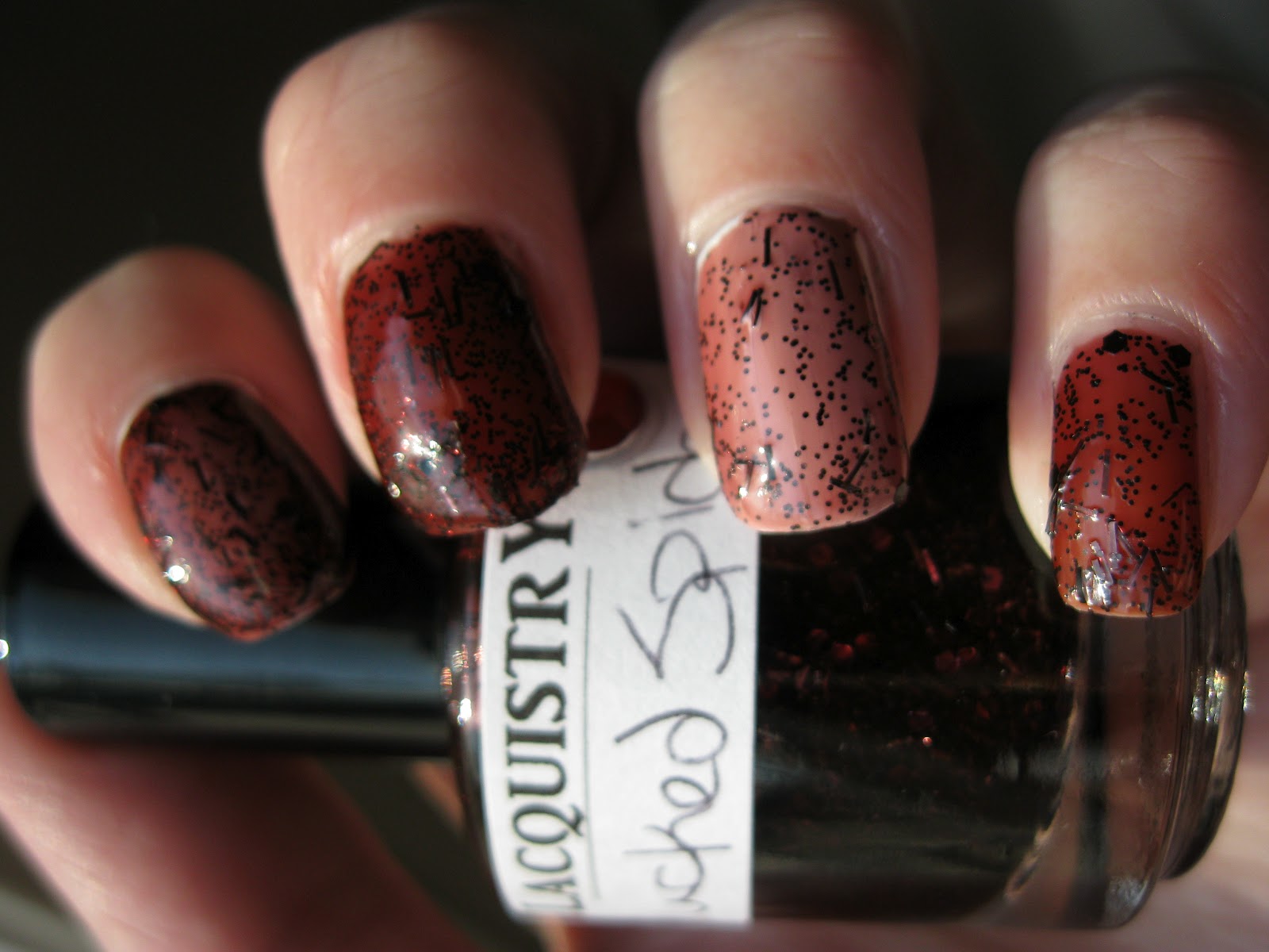
A short while ago I posted a review of Lacquistry's Plucked Spider, which I had layered over Essie Bordeaux, a deep red jelly. I wasn't so keen on the result, and several readers had mused about what it might look like overtop of a lighter base. Today I have swatches of Plucked Spider overtop of a plain white base (Zoya's Snow White), as well as Plucked Spider by itself, without anything underneath it.


Left to right: two coats of Plucked Spider over white, two coats of Plucked Spider by itself, one coat of Plucked Spider over white, one coat of Plucked Spider by itself.  


I have to be honest, I'm still not loving Plucked Spider. In the bottle it is very interesting to look at, but on the nail, I'm just not feeling it. The glitter still doesn't pop, although I'll grant that it is a neat concept and I do like the name. The formula was also incredibly hard to work with, extremely gloopy and globby (I'm not actually sure either of those are legitimate words, but I'm gonna use them). It was like trying to paint my nails with strawberry jam, both in texture and appearance.

What do you all think of Lacquistry's Plucked Spider now? It is better than it was over Essie Bordeaux? Or is it still lacking?

Thursday, April 5, 2012

Quo by Orly Celestial Star / Sally Hansen HD Laser Comparison

I have a comparison post for you today, featuring two very similar colours (likely dupes). Quo by Orly Celestial Star (I'm pretty sure this is a re-packaging of one of the colours form the Orly Cosmic FX collection- Lunar Eclipse, I think?) and Sally Hansen HD Laser.

I picked up Sally Hansen HD Laser about two years ago, and really love it. The colour is phenomenal, a deep cobalt blue, very sparkly and reflective. More visible in the bottle, but still slightly visible on the nail is a purple duochrome. This colour has tonnes of depth. The catch? It's extremely sheer. You'd have to do at least four coats to see it at its ideal colour.

Enter Orly by Quo Celestial Star. Which, I must point out, is kind of a silly name. I mean, aren't stars celestial by definition? It's not like you have your celestial stars, and then your something-other-than-celestial stars. Anyways, moving on. Loving Sally Hansen Laser as much as I do (but hating the formula), I couldn't quite resist the temptation to pick up Quo by Orly Celestial Star. The Quo by Orly line is unique to Canada, and you can find it at Shopper's DrugMart.

Celestial Star and Laser look pretty much identical in the bottle:


And here they are at two coats of polish. Laser is on the index and ring fingers, Celestial Star on the middle and pinky.


You can see how sheer Laser is at two coats. In contact, Celestial Star is far more pigmented.


I absolutely love the super-shiny reflective sparkly finish this has. It's very attention grabbing, and even in low-lighting is just seems to glow. It's one of my very favourite polishes.


What do you think of Laser and Celestial Star? Given the chance would you spring for the Orly by Quo version? Or do you already own the equivalent Orly from the Cosmic FX collection?

All this talk of celestial bodies and cosmic phenomena has me thinking of one thing:


Friday, March 30, 2012

China Glaze Hunger Games Comparison - Harvest Moon

As soon as I saw the first pictures of the China Glaze Hunger Games collection I knew I had to have Harvest Moon. I have a weakness for all coppery metallics, and despite having several lacquers that fall into that category, Harvest Moon found its way home with me. This is a comparison featuring a few of the closest colours I have to China Glaze Harvest Moon. These are the likely suspects:

Left to Right: China Glaze Cracked Medallion, China Glaze Harvest Moon, MAC Originality, China Glaze Foxy, OPI DS Glow, OPI Pros and Bronze. 

Obviously, Cracked Medallion can't really be too similar to Harvest Moon because it is a crackle polish, but in the bottle they are similar, so I added it in. China Glaze Foxy is also far more red on the nail, but in the bottle a lot of the bronzy shimmer was visible, so that came along as well. Here they are on the nail:


Left to Right (index finger through pinky): MAC Originality, China Glaze Harvest Moon, OPI DS Glow, OPI Pros and Bronze. The thumb is China Glaze Foxy. 


I thought MAC Originality would be closer to Harvest Moon, by the latter is darker and warmer, with a slightly orange caste to it. The other shades are all leaning towards a lighter bronze. OPI Glow has a mixture of larger particles in different shades of gold and bronze. It's probably the sparkliest of these. OPI Pros and Bronze is unique in this bunch for being quite pink, along with the light gold/bronze particles it contains. It is also the sheerest polish in this bunch.


And here is my Cracked Medallion fail; I applied it over still-wet polish which caused it to not really crackle much at all. It's a sparkly medium bronze, anyways.


Out of these shades, I'm a big fan of both MAC Originality (one of MAC's home-runs when it comes to lacquers- they are notorious for being hit and miss in the polish department), and OPI DS Glow. Glow is lovely, but also takes several coats to build up to it's best potential. China Glaze Harvest Moon is significantly different from both of those polishes, and certainly unique enough to warrant picking up. It also has an outstanding formula; it's easy to apply and opaque in two coats. It's also gorgeous: pigmented and eye-catching, an incredibly sparkly deep copper metallic. Beautiful!

Copper Domo approves of this copper comparison. Do you?